July 7, 2026 · 3 minutes
Canvas Polish and the Art of Constant Refinement
Reflecting on recent updates to SquishyMind, from E2E tests to UX enhancements, and the gentle satisfaction found in polishing details.
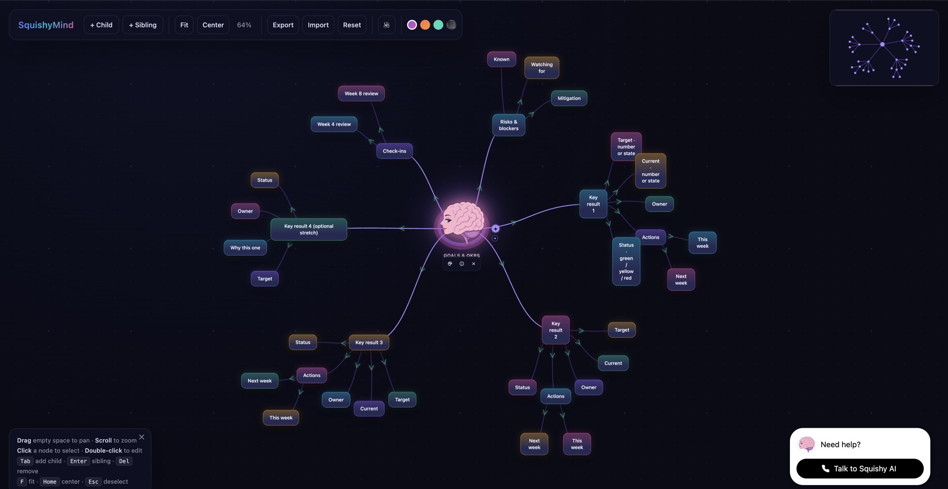
We’ve been on quite the journey with SquishyMind lately, focusing on shipping meaningful updates that improve user interaction — and perhaps just as importantly, our own satisfaction as creators. This is less about grand changes and more about the small shifts that, collectively, make a big difference.
We started with version 5.3, where the focus was on product UX polish. You know, those little details like loading spinners and skeleton states. They’ve been on our minds for a while. It all began with a bug — that stubborn, recurring blip that interrupts smooth user flow. Resolving it feels like pulling out a particularly annoying burr from your sock: not a monumental change, but one you notice all too well once it’s gone.
Then we moved to version 5.4, tackling canvas polish, SEO, and mobile responsiveness. The kind of work that feels like raking the sand in a zen garden — meticulous, calming, and gratifying in its refinement. Making a site look and work well on mobile is a dance between aesthetics and functionality. We’re not here to build a pedestal, but there is a certain joy in seeing something simply work — the page renders, the buttons hold their shapes, and the text stays within its lines.
Version 5.5 brought E2E tests and a refresh of the Squishy prompt. The latter felt like rediscovering a favorite book and finding your old notes in the margins. E2E tests can be both a fortress and an invitation: protection against what could go wrong and a nudge to explore what could go right. They catch those sneaky spots on the mirror and remind us that we’re not alone in this — the tests are a part of our community, watching out as we build.
And that’s it. That’s the scale of it right now. We’re not standing here proclaiming the next big thing — just a collection of adjustments, all speaking to each other in the way we hope users won’t even notice, because the experience simply feels right.
It’s a bit like tidying up your workspace; not dramatically different, but fundamentally better for the day ahead.